-
Get involved.
We want your input!
Apply for Membership and join the conversations about everything related to broadcasting.
After we receive your registration, a moderator will review it. After your registration is approved, you will be permitted to post.
If you use a disposable or false email address, your registration will be rejected.
After your membership is approved, please take a minute to tell us a little bit about yourself.
https://www.radiodiscussions.com/forums/introduce-yourself.1088/
Thanks in advance and have fun!
RadioDiscussions Administrators
You are using an out of date browser. It may not display this or other websites correctly.
You should upgrade or use an alternative browser.
You should upgrade or use an alternative browser.
Best/Worst/Most Interesting TV Station Logos
- Thread starter Ed Nielson
- Start date

On first view, the logo is confusing. The arrow subjugates the "5" so that the main purpose is fuzzy at best.
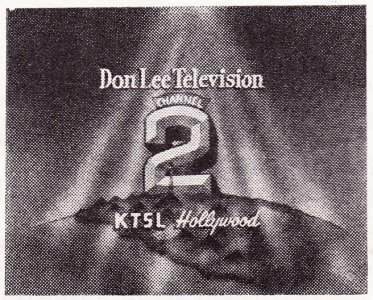
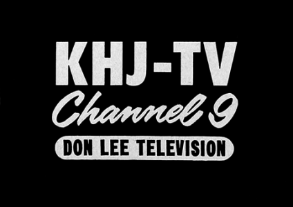
Here are some interesting ones in Los Angeles TV History KTSL-TV and KHJ-TV were at some point owned by Don Lee Television. The more interesting part is that these two TV stations are currently manage by Paramount as CBS Los Angeles and KCAL News.
Attachments


And also WROC in Rochester!Amongst old school logos, I always was fond of the "ei8ht" variants (WJW-TV Cleveland, KFMB-TV San Diego, later KAET Phoenix).
View attachment 8838
Also KOMU-TV, Columbia, Mo. in the mid-to-late 1970s. I was there!Amongst old school logos, I always was fond of the "ei8ht" variants (WJW-TV Cleveland, KFMB-TV San Diego, later KAET Phoenix).
View attachment 8838
The KTVU and KRON logos in the San Francisco Bay Area have been enduring classics.
A favorite from earlier on, as you'll be able to tell from the call letters, is from St. Louis' KMOX-TV. The static image doesn't do it justice; the ID was actually a short film where a strip was folded to make the "4":
.
Later versions took the different colors out.
(St. Louis local television in the 1970s was really competitive; CBS used KMOX-TV as its laboratory for new technology and KSD-TV and even KTVI had to run hard to keep up. That made everyone better.)
A logo that I can't find online was from WHO-TV in Des Moines in the late 1960s, also an animated film. The film zoomed in on one of the eyes of a stylized owl. When the eye was in close-up, showing the WHO-TV call letters, the eyelid went down. When the eyelid opened, the number "13" appeared, which was WHO-TV's channel number.

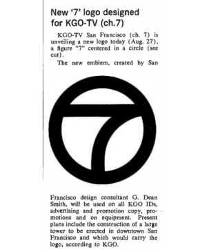
The ABC7 Logo it has to be one of the most recognized logos within Disney has used once they took over ABC and their owned stations three decades ago. Prior to the mid 1990's ABC O&O's had this variant where it was then known as the circle 7 logo without the ABC Logo attached to the circle 7 by G. Dean Smith. Also this widely recognized logo was originally meant for KGO-TV San Francisco prior to ABC spreading its use to the other O&O's and affiliates whose ABC affiliate is on Analog or cable 7 in their respective markets.

Attachments
KRON's is awesome simply because of the Golden Gate Bridge reference connecting it to something local.The KTVU and KRON logos in the San Francisco Bay Area have been enduring classics.
"Anklepants?"I always liked the WNEV-TV (now WHDH) Boston logo as well as the Westinghouse Group W "anklepants" logos (old KYW-TV, for example).
View attachment 8839View attachment 8840

Group W used that font for all their radio and TV stations.
Attachments
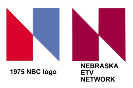
Then there was the Nebraska ETV/NBC debacle.
A quick summary: In 1974, Nebraska ETV adopted a new logo in. A year later, NBC adopted a new logo. NETV sued and it was eventually settled out of court, with NETV allowing NBC to keep using the logo, but contributed equipment to NETV.
A quick summary: In 1974, Nebraska ETV adopted a new logo in. A year later, NBC adopted a new logo. NETV sued and it was eventually settled out of court, with NETV allowing NBC to keep using the logo, but contributed equipment to NETV.
Attachments
Then there was the Nebraska ETV/NBC debacle.
A quick summary: In 1974, Nebraska ETV adopted a new logo in. A year later, NBC adopted a new logo. NETV sued and it was eventually settled out of court, with NETV allowing NBC to keep using the logo, but contributed equipment to NETV.
WNBC's Tom Snyder summarized the debacle pretty effectively:
"Anklepants?"
Group W used that font for all their radio and TV stations.
You can see more Anklepants than thought possible in this early '80s Group W orientation tape:

I really dislike the logo of KIII-TV, Corpus Christi, TX (in particular, the 3 logo). It looks dated and unfriendly to me. Curious what others think.
View attachment 8850
KTVK in Phoenix used the same logo in the late 1970s--and dropped it in 1980, probably thinking it looked outdated!
The Group W font was NOT "Anklepants."
That's a knockoff free font that imitated (badly, in some cases) the actual Group W font, which dates to the 1960s and did NOT have a name.
Was the original font designed specifically for Group W?