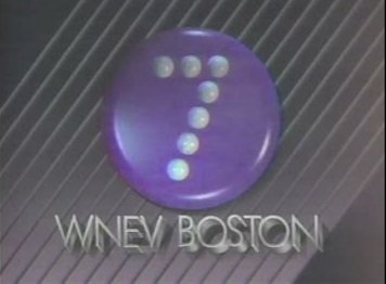
Kinda just leaves me scratching my head ... what is it? 🙄I really dislike the logo of KIII-TV, Corpus Christi, TX (in particular, the 3 logo). It looks dated and unfriendly to me. Curious what others think.
View attachment 8850
-
Get involved.
We want your input!
Apply for Membership and join the conversations about everything related to broadcasting.
After we receive your registration, a moderator will review it. After your registration is approved, you will be permitted to post.
If you use a disposable or false email address, your registration will be rejected.
After your membership is approved, please take a minute to tell us a little bit about yourself.
https://www.radiodiscussions.com/forums/introduce-yourself.1088/
Thanks in advance and have fun!
RadioDiscussions Administrators
You are using an out of date browser. It may not display this or other websites correctly.
You should upgrade or use an alternative browser.
You should upgrade or use an alternative browser.
Best/Worst/Most Interesting TV Station Logos
- Thread starter Ed Nielson
- Start date
It was, by the design firm Lippincott & Margulies.Was the original font designed specifically for Group W?
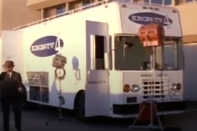
There's an old movie called Colluses: The Forbin Project that shows a late 60s, early 70s KRON 4 logo on a van. I took a screen shot from the movie of the truck below.The KTVU and KRON logos in the San Francisco Bay Area have been enduring classics.
A favorite from earlier on, as you'll be able to tell from the call letters, is from St. Louis' KMOX-TV. The static image doesn't do it justice; the ID was actually a short film where a strip was folded to make the "4":
.View attachment 8843
Later versions took the different colors out.
(St. Louis local television in the 1970s was really competitive; CBS used KMOX-TV as its laboratory for new technology and KSD-TV and even KTVI had to run hard to keep up. That made everyone better.)
A logo that I can't find online was from WHO-TV in Des Moines in the late 1960s, also an animated film. The film zoomed in on one of the eyes of a stylized owl. When the eye was in close-up, showing the WHO-TV call letters, the eyelid went down. When the eyelid opened, the number "13" appeared, which was WHO-TV's channel number.
Attachments
I really dislike the logo of KIII-TV, Corpus Christi, TX (in particular, the 3 logo). It looks dated and unfriendly to me. Curious what others think.
View attachment 8850
It's surprising Tegna has left this logo unchanged, but under McKinnon KIII was so dominant it made sense. Many of the visual trappings were shared in their station group: KUSI had a very similarly designed logo in the 1980s.

My avatar is another Texas logo oddity, one that was completely unrepresented until I found it. (Coloring is speculative on my part after I retraced it) It's the short-lived KZLN 60 Harlingen, Texas, the public TV station that started at the wrong time in the wrong place and only operated under that call sign for 14 months.
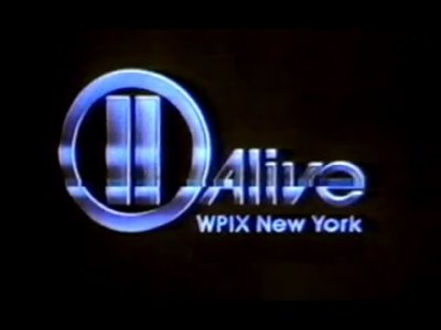
I've been fond of the WPIX-TV channel 11 logo from the Eighties, "11 Alive", using the shape of the World Trade Center twin towers. (The earlier "11 Alive" logo was, IMO, just meh.) The logo has a poignancy to it in the aftermath of the 9/11/2001 attack that took them down.
Attachments
It’s horrid. I’ve always found it ugly. The lower case calls add insult to it.I really dislike the logo of KIII-TV, Corpus Christi, TX (in particular, the 3 logo). It looks dated and unfriendly to me. Curious what others think.
View attachment 8850
The Corpus stations all need a refresh. KZTV’s looks like someone made that in about 30 seconds in PowerPoint.
It reminds me of the recent logo used by Mexico's Televisa-Univision Channel 5.I thought this could be interesting. I'm starting off with the classic stylized 5 from WCVB in Boston.
I've been fond of the WPIX-TV channel 11 logo from the Eighties, "11 Alive", using the shape of the World Trade Center twin towers. (The earlier "11 Alive" logo was, IMO, just meh.) The logo has a poignancy to it in the aftermath of the 9/11/2001 attack that took them down.
RTL2 in Germany used a very similar design, but with the proportions slightly modified to make the "II" look more like an on/off button. Here it is in action (but ignore the first, older ID with a different logo):
What's interesting about that one is that you see a 5 inside of another 5.It reminds me of the recent logo used by Mexico's Televisa-Univision Channel 5.

Similar, yes, but to my eye RTL's version resembles a pair of silver bullion bars. The PIX 11 logo was more 3-D, so it looked like the twin towers, especially to locals familiar with their iconic shape.RTL2 in Germany used a very similar design, but with the proportions slightly modified to make the "II" look more like an on/off button. Here it is in action (but ignore the first, older ID with a different logo):

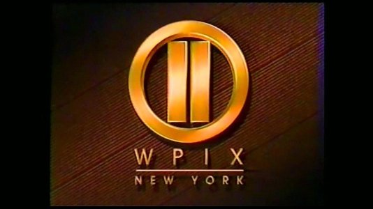
KPLR-TV
"Centre Television Network" and this "Eleven Tree" logo were used by KPLR-TV to promote its reach as a "superstation" on Midwestern U.S. cable systems.[1] This logo is similar to the one used by then-sister station WPIX in New York City. This logo was also shared by WPIX. Official website
KPLR-TV St. Louis at one point even used the Circle 11 Logo from WPIX-TV. But in KPLR-TV’s case they made the circle 11 under Koplar’s ownership mainly to promote their then Analog Channel on 11 in the 1980’s and 1990’s
As of 2025 WPIX-TV and KPLR-TV are managed by Nexstar.
Sorry, I meant the pause button.RTL2 in Germany used a very similar design, but with the proportions slightly modified to make the "II" look more like an on/off button.
Puts images of the devil in my head.I really dislike the logo of KIII-TV, Corpus Christi, TX (in particular, the 3 logo). It looks dated and unfriendly to me. Curious what others think.
View attachment 8850
I never cared for their logo but channel 5 in Boston has been a force to be reckoned with in local television for half a century.On first view, the logo is confusing. The arrow subjugates the "5" so that the main purpose is fuzzy at best.
Does anyone know of any station on ch. 11 that used "e11even" with the two L's stylized as ones? A quick search only turned up some night club in Miami...
I have a confession to make...The Group W font was NOT "Anklepants."
That's a knockoff free font that imitated (badly, in some cases) the actual Group W font, which dates to the 1960s and did NOT have a name.
Back around 1997, Ray Larabie, the Canadian typographer who created "Anklepants" did so after I suggested that the Group W logotype would make a neat font seeing that he had created fonts based on band and company logotypes. I sent some scans of various Group W station logos and he had it done within a few hours! Not the name I would have chosen but I just loved that it existed at all.
Somebody else created a font called "Westinghouse" that addresses some of the deficiencies of Anklepants.